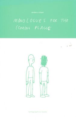
I’ve been following Anders Nielsen’s work since the very first issue of Big Questions. I’ve witnessed, therefore, the slow-paced but steadily outstanding growth of one of the most refined author of comics of the last years.
Perhaps we’re too close to his work, especially the recent Monologues for the Coming Plague, to fully acknowledge the importance of Nielsen’s oeuvre. But why pull any punches? Nielsen is a master of the understatement.
As one flips the pages of Monologues, there are two things happening: speed and backlash.
Speed because the one-illustration-per-page makes its reading, while a physical act, quite fast-paced. That’s not a bad thing. In fact, in a very weird manner, taking in account the apparent simplicity of Nielsen’s drawings and short sentences, it echoes the proverbial “times in which we live in”.
Backlash because only as an after-effect we get the full force of what’s at stake.
It’s only to be expected that people will deal with this book with a certain number of erroneous attitudes triggered by its superficial characteristics. But what apparently looks like last-minute thoughts or doodles over the phone, is actually something extremely purified, something very powerful that reminds me of the old Chinese legend (retold by Borges, among others) of the painter-calligrapher Chuang Tzu, who spent ten years to draw a single crab, but when he did it, he did it to perfection. But with a twist to this: what seems to be trivial, even meaningless jottings add up to a commentary on itself, both as an act of artistic endeavour (an expressive means) as well as of communication (a means of transference of meanings). The materials of which Monologues is made are extant to disappear. They are but vestiges or symptoms of the artists’ gesture.
 In a time in which slickness has become the norm in both mainstream and alternative comics, few are the artists who’re strong enough to go beyond such an imperative, and who’ve been dealing out simple and pleasurable approaches to comic-making. One could mention Jeffrey Brown, Gregor Wiggert or Joann Sfar at this point (to show that these are really global tendencies). Although all of these artists, and several others, have quite distinctive styles and use it for very different ends, they do share an easy-going approach to what one could call its “final rendering”. They’ve raised a personal calligraphy into a means of comics-construction; they write comics more than they draw them. From this group, Nielsen is the most dedicated to the distillation of this pleasure, reducing the need for immediate legibility or the imperatives of clarity for all.
Still, there is a direction towards narrative. Many others have used the “doodled” character to narrativity purposes – I’m thinking of Thurber and Steig mostly, and perhaps Steinberg too. But it seems to me that narrativity, in Nielsen’s work, is becoming more and more as an afterthought as each doodle becomes, first and foremost, itself. Granted, the repetition of the characters involved imposes something quite different than mere individualistic cartoons. In an introductory text that Gombrich produced for a book on doodles, the famous historian discusses Paul Klee’s work and the relationship of the doodle with “intention”, precisely what would distinguish any doodle-as-such from clinical ones or from children’s drawings and from more “artistic” endeavours. “Far from setting out with a firm intention, [Klee] allowed the shapes to grow under his hand, following them wherever they led him”. Isn’t this what’s developing in Monologues? I don’t think a clear-cut direction was put forth on the outset itself, but it emerged nonetheless, and looking back at it, it is a firm one.
At this point, Dave Shrigley comes immediately to mind, perhaps a little too easily and shallowly, but I do feel that both share a very similar and uncommon capacity to most artists for illuminating, through sheer absurdity, on both content and form (a false dichotomy, as all dichotomies), our daily gestures of hostility towards the chaos that really makes up life. A hostility that bears the name of “order”, of “meaningfulness”… Another point of commonality with Shrigley’s work, and a few other artists perhaps, is the mode after which these drawings are not subsumed in any other end except their very own existence, although there is a far clearer narrative structuring in Nielsen, as mentioned before.
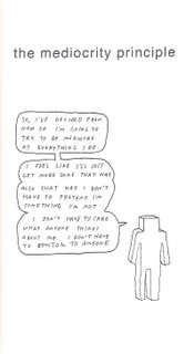
The features of the characters are quite simple, almost unexpressive. I don’t like to use the word “minimalist” because, above all, it has had its life in other arts and such a comparison is derisory, and on the other hand it implies no “reduction” whatsoever; what is drawn is what was drawn, period. There is no “simplification” (which would beg the question of “what does it simplify?”), for there is nothing beforehand, it simply emerges as such. A little in the beginning of the Gombrich text I mentioned earlier, the author quotes Leonardo’s Treatise on Painting, in which “what he called ‘un componiemento inculto’, an untidy sketch, was preferable for arousing the mind”. And arousing the mind via untidiness is precisely what Anders Nielsen is doing, as if he is expanding the field of comics through sheer inaction, thus making his “mediocrity principle” both a lie and a springboard in relation to that end. This is not a contradiction, of course, for human existence is full of them, it is made by them.
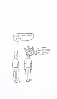
 This “incult atempt” (a more literal translation of Leonardo’s expression) is present in many of the oscillations in Nielsen’s work, a present with two realities, apparently antagonistic. For instance, Nielsen’s figures are representational only to the point they become non-representational; they deny the characters their own traits. I’m not speaking only for the fact that one of the characters has scratches for a head. I’m talking of their representation and what their physiognomies should signify at a first glance. Even in the “car wreck scene”, there is not much happening in visual changes of the face of one of the characters, while the other seems to change heads at every page, changes of no consequence at all towards the meaning of the “contextual scene” itself. But the overall force is derisorily elusive. It does not matter. It is the matter. It would be extremely easy to stage these monologues with real people, a few props and simple stage directions. And we would not be far from a Beckett or a Cocteau play.
Another interesting contradiction, and still related to all of this, is that his work seems to be flexible – where a more normative view of comics is concerned – but actually to serve the purpose of underlining a very strong rigidity. It makes us concentrate on what’s happening at the flipping of each new page. If I’m allowed a lousy metaphor, Monologues first half feels like a successfully played game of Tetris: each page is like a new “brick”, which adds a new element of signification to the whole, and after a certain while we realize a whole new layer of meanings that changes completely everything we had learned until that point.
This is nothing new in Nielsen’s oeuvre, given the fact that with his Big Questions (still in progress), the expression “the plot thickens” really gained a very evident existence with each new instalment. And paying close attention to the experiences in Mome, we know that Nielsen is trying out multiple territories at the same time. I don’t believe much in “evolution” where art is concerned, nor in the “progress” of an artist… What I do is to understand such a path as a trial-and-error trajectory in which every single experience is done under the maximum will…
All the better for those who take up his challenge.
Nota: este artigo foi escrito e submetido ao The Comics Journal, mas os editores - com razão - mandaram-me comer mais bife. Espero que não seja incómodo seguir no inglês. Enjoy.
Nota: agradecimentos à Annie McPheeters por me ter passado os primeiros números do Big Questions, depois de um encontro em S.F. Há pequenos gestos que de facto ecoam em consequências inimagináveis...


Não faço ideia da razão que Michael Dean invocou para recusar este texto. Só pode mesmo ser porque já têm outro sobre o mesmo tema.
ResponderEliminarPorque não passas o texto sobre Feiffer para inglês e tentas de novo? Encaixa bem na review mais leve, não tem tanto de ensaístico. Pode ser que seja mais isso que ele quer, quem sabe?
É um comentário mais teórico do que visual. Foi interessante ler. A palavra que predominou ao longo da leitura de Big Questions foi sempre 'existencial'. Aqui está outro artigo sobre o homem:
ResponderEliminarhttp://www.comicbookgalaxy.com/
review_111605_bigquestions_BN.html
O meu interesse foi sempre o foco no livro como um objecto e a percepção do leitor/comprador/coleccionador no que diz respeito a edições limitadas (mini-comics) e como editoras usaram o conceito de objecto único/limitado para produzir trabalhos mais chegados ao lado de 'arte' do que 'BD'. Estou a pensar em Kramer's Ergot, que foi o ultimate spell-out desta tendência para maior parte das pessoas que não estavam suficientemente atentas. Big Questions tem uma certa tendência 'mini' mesmo da meneira como foi produzido - simples agrafos mostra, ser o suficiente. Até pensei escrever a minha 'would be' tese sobre isto. Mas depois não avançou.
Agora gostava de saber? O que achou o comics journal que isto tinha de mal?
Os meus objectivos críticos são, precisamente, mais teóricos - a maior parte das vezes - do que expositivos, divulgadores ou descritivos. Por isso, as associações todas (já falei aqui neste blog da Kramer's Ergot e de outras publicações que caem nesse campo.
ResponderEliminarQuanto à TCJ, simplesmente não respondeu (ainda?), mas avisando que o facto de eu não ser "native speaker" poderia ser um impedimento. É justo.
Obrigado,
Pedro
O blog da FAMILY LA contém uma review sobre Anders Nilsen escrito por Sammy Harkham
ResponderEliminarhttp://www.familylosangeles.com/blog/index.html
Só para adicionar:
Ao princípio pensei que todos os Big Questions tivessem sido feitos pela D&Q. Depois de ler o blog da FAMILY apercebi-me que só depois da #8 é que foi publicado pela D&Q, que escolheu agrafar o livro, o que é interessante. Gostava de saber se foi mesmo para tentar dar a impressão de se tratar dum mini-comic ou se foi por uma questão de poupança $$$.
ResponderEliminarOlá, RT.
ResponderEliminarEssa informação já havia sido dada por mim, anteriormente, no post sobre o fanzine do Nilsen (é seguir o link), onde faço o historial desse mesmo título. O artigo do Arkham é bom, mas eu cheguei primeiro. Yeeeah!